Website Focused on Easy to Find or Call: Antai

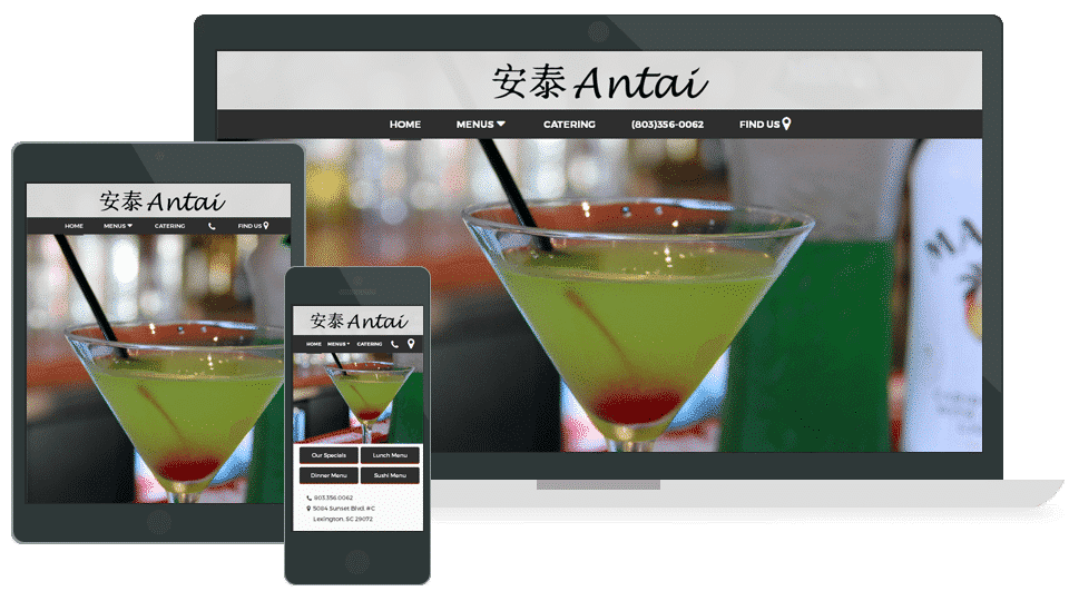
Antai Gourmet Dining came to us with a one track mind! Mobile, Mobile, Mobile... We loved it! I preach it all the time responsive is king and mobile is the most important thing for your business.
Most of the time when we are developing a website the client wants more on the site, they want more pictures, more text, basically more fluff. GWD is usually telling it's clients to simplify and cut out the fluff. When working with Antai, it was the opposite. They were so focused on an easy mobile friendly webapp that they were the ones telling us to simplify!
Check out this website, but I require that you do it from your phone, it's a mobile masterpiece!
Take Pride In your Work!
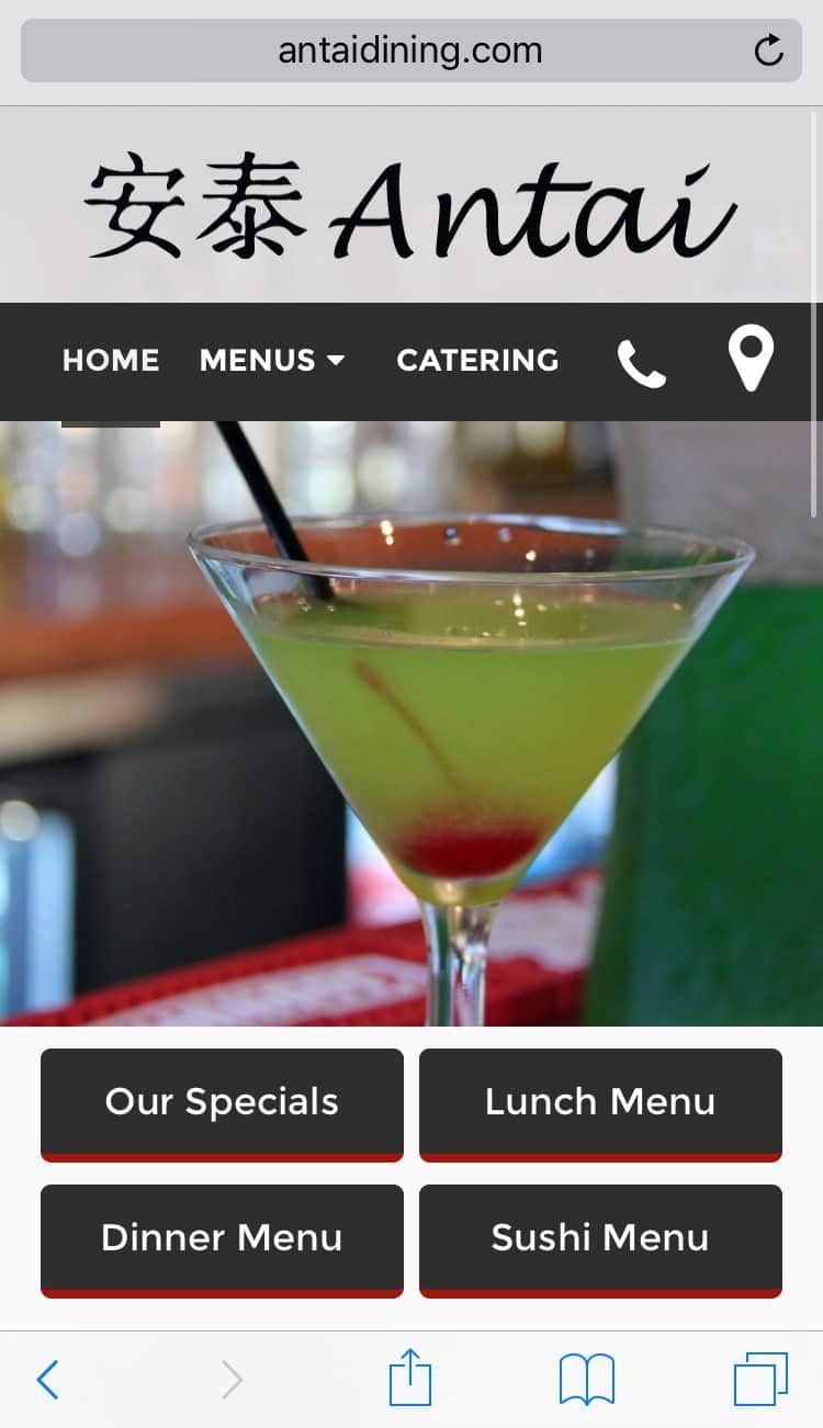
I am a big believer in taking pride in your work. At GWD, we try to act like we are old school woodworkers or fine craftsmen. This screenshot of the Antai website on mobile is a perfect example of this.
We worked with the client going back and fourth until it was exactly how we wanted it. Some of the key aspects include:
- Simple Logo: doesn't take up too much vertical real-estate
- Watered Down Menu: we didn't want to hide it under the normal three bar menu icon. This was a huge aspect that we focused on. We've never built a menu this simple that is one tap on mobile. Most menus are two tap, one to open and one to select a link. We are very proud of this menu!
- Main Image: simple, product focused.
- Menu Icons: haha, yes confusing... I mean quick links to the restaurants food menu. These are astutely sized to be easy to tap and also fit inside the "top of the fold" view on most smartphones.
I hope you take a second to enjoy our hard work on this site. We love to hear any feedback you have!

