
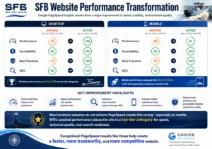
Your website needs to be mobile friendly!
Your website needs to be mobile friendly!

The Importance of a Mobile-Friendly Website in Today's Digital Landscape In today's fast-paced digital world, having a mobile-friendly website is no longer just an option – it's a necessity. With the increasing number of people using their smartphones and tablets to access the internet, businesses must ensure that their websites are optimized for these devices to stay competitive and relevant. A mobile-friendly website not only improves user experience but also boosts search visibility, increases lead generation, and enhances brand identity.
Why Mobile-Friendly Websites Matter According to Statcounter, approximately 60% of internet traffic comes from mobile devices. This means that if your website isn't optimized for mobile viewing, you're potentially missing out on a significant portion of your target audience. A mobile-friendly website ensures that visitors can easily view, click, and access digital content, regardless of the device they're using. This helps maintain site traffic and reduces bounce rates, ultimately leading to higher conversions and better overall performance.
Best Practices for Designing a Mobile-Friendly Website To create a mobile-friendly website that caters to the needs of your users, consider implementing the following best practices:
- Develop a responsive layout: A responsive layout automatically adjusts to fit the screen size of the user's device, ensuring that content is displayed correctly and navigation is seamless. This approach eliminates the need for separate mobile and desktop versions of your website, making it easier to maintain and update.
- Optimize website speed: Slow-loading websites can frustrate users and lead to higher bounce rates. To improve your site's speed, compress images, minimize the use of heavy scripts, and leverage browser caching.
- Compress images: Large image files can significantly slow down your website's loading time. Use image compression tools to reduce file sizes without compromising quality.
- Use HTML5 instead of Adobe Flash: Many mobile devices do not support Adobe Flash, making it difficult for users to view content that relies on this technology. Opt for HTML5, which is widely supported across devices and offers better performance.
- Avoid pop-ups: Pop-ups can be intrusive and difficult to close on mobile devices, leading to a poor user experience. Instead, consider using less obtrusive methods to display important information or promotions.
- Change button size and placement: Ensure that buttons are large enough to be easily tapped with a thumb and placed in easily accessible areas of the screen.
- Use a large and readable font: Small text can be difficult to read on mobile devices, so opt for a larger font size that is easy to read without zooming in.
- Space out links: To prevent users from accidentally tapping the wrong link, make sure there is ample space between clickable elements.
- Declutter web design: Keep your website's design clean and simple, focusing on essential content and features. This will make it easier for users to navigate and find what they're looking for. 10. Test your website on multiple devices: Regularly test your website on various devices and screen sizes to ensure that it remains user-friendly and functional.
We can’t solve your problem if you don’t tell us about it!
We give free consultations.
The Drawbacks of Not Having a Mobile-Friendly Website Failing to optimize your website for mobile devices can have several negative consequences, including:
- Poor user experience: Users may struggle to navigate your site, leading to frustration and a higher likelihood of leaving without completing their intended action.
- Lower search engine rankings: Google prioritizes mobile-friendly websites in its search results, meaning that non-optimized sites may rank lower and receive less organic traffic.
- Reduced conversions: If users find it difficult to interact with your website on their mobile devices, they may be less likely to convert into customers or subscribers.
- Damaged brand reputation: A poorly designed mobile website can reflect negatively on your brand, causing potential customers to question the quality of your products or services.
Embracing Web Design Trends for 2023 As technology continues to evolve, web design trends will also shift to accommodate new devices and user preferences.
Some of the most notable trends for 2023 include:
- Organic shapes: Moving away from geometric designs, organic shapes offer a more natural and fluid aesthetic.
- Thumb-friendly mobile navigation: As users increasingly rely on their thumbs to navigate websites, designers must prioritize thumb-friendly layouts and button placements.
- Smart video: Integrating video content that is both engaging and optimized for mobile viewing.
- Material design: A design language that focuses on simplicity, clean lines, and bold colors.
- Text-only hero images: Replacing large, resource-heavy images with text-based designs that load quickly and convey essential information.
- Custom illustrations: Unique illustrations that add personality and visual interest to your website.
- Full-page headers: Eye-catching headers that span the entire width of the screen, creating a strong visual impact.
- Dark mode: Offering users the option to switch to a dark theme, which can reduce eye strain and improve battery life on mobile devices.
In conclusion, having a mobile-friendly website is crucial for businesses in today's digital landscape. By implementing best practices and staying up-to-date with the latest web design trends, you can ensure that your website remains accessible, user-friendly, and competitive in the ever-evolving online world.
Citations :
- https://www.browserstack.com/guide/how-to-make-website-mobile-friendly
- https://mailchimp.com/resources/mobile-website/
- https://www.weblite.com.my/blog/reasons-why-a-mobile-friendly-website-is-important#:~:text=Mobile%2Dfriendly%20websites%20boost%20your,without%20being%20annoyed%20or%20inconvenienced.
- https://www.techtarget.com/whatis/feature/Best-practices-to-make-a-mobile-friendly-website
- https://www.figmentagency.com/blog/consequences-of-a-website-thats-not-mobile-friendly/
- https://blog.hubspot.com/marketing/web-design-trends-2017
- https://www.theedigital.com/blog/web-design-trends
- https://www.linkedin.com/pulse/importance-mobile-friendly-website-maruf-sarwar
- https://www.ucraft.com/blog/7-best-practices-of-mobile-friendly-websites
- https://www.indeed.com/career-advice/career-development/mobile-friendly#:~:text=A%20mobile%2Dfriendly%20website%20makes,and%20reduce%20your%20bounce%20rate%20.
- https://madebyshape.co.uk/web-design-blog/how-not-having-a-mobile-friendly-site-hurts-your-business/
- https://mrvirk.com/your-page-is-not-mobile-friendly.html#:~:text=For%20your%20website%20to%20get,the%20files%20on%20the%20page.&text=When%20Google%20Bot%20access%20these,properly%20when%20it%20scans%20it.
- https://digitalcoastmarketing.com/is-a-mobile-friendly-website-really-needed/#:~:text=Websites%20that%20are%20not%20easily,the%20content%20on%20the%20site.
- https://blog.hubspot.com/marketing/web-design-trends-2017#:~:text=In%202023%2C%20web%20designers%20will,inform%20visitors%20about%20their%20company.
- https://www.seohermit.com/articles/importance-of-having-a-mobile-friendly-website/
- https://www.hswsolutions.com/resources/why-a-mobile-friendly-website-is-important/#:~:text=Standard%20desktop%20websites%20do%20not,friendly%20buttons%20and%20page%20elements
- https://www.hswsolutions.com/resources/why-a-mobile-friendly-website-is-important/


Grover Web Design
Want Donny to look at your website next?
Book 20 minutes with Donny Grover to talk through your website, performance, SEO, or custom development priorities with a real next step in mind.