Mobile Traffic Is Now Majority – Tuesday Tips

This should not be a surprise to anyone, we were on this path for a while now. It's official, in early 2017, mobile traffic is now the majority of traffic on the web.
Yes, mobile web traffic from smartphones has been the leader of all traffic source since about 2015, but now in 2017, it's the majority. All other traffic sources add up to the same or less than phones, this includes desktops, tablets, TVs, and any other weird devices!
Why Is this Significant?
Beyond the obvious reason that smartphones are dominating media, this is significant because most websites are still designed for desktop. It's natural to build websites on and for desktops. I'm a web developer with 15+ years of experience and even today about 95% of my clients only test their website on a computer. I encourage them to use a phone, but when doing work and testing, people naturally gravitate towards their computer.
There are still a huge number of websites that are not mobile friendly, as a business you have to be insane to not be mobile friendly these days!
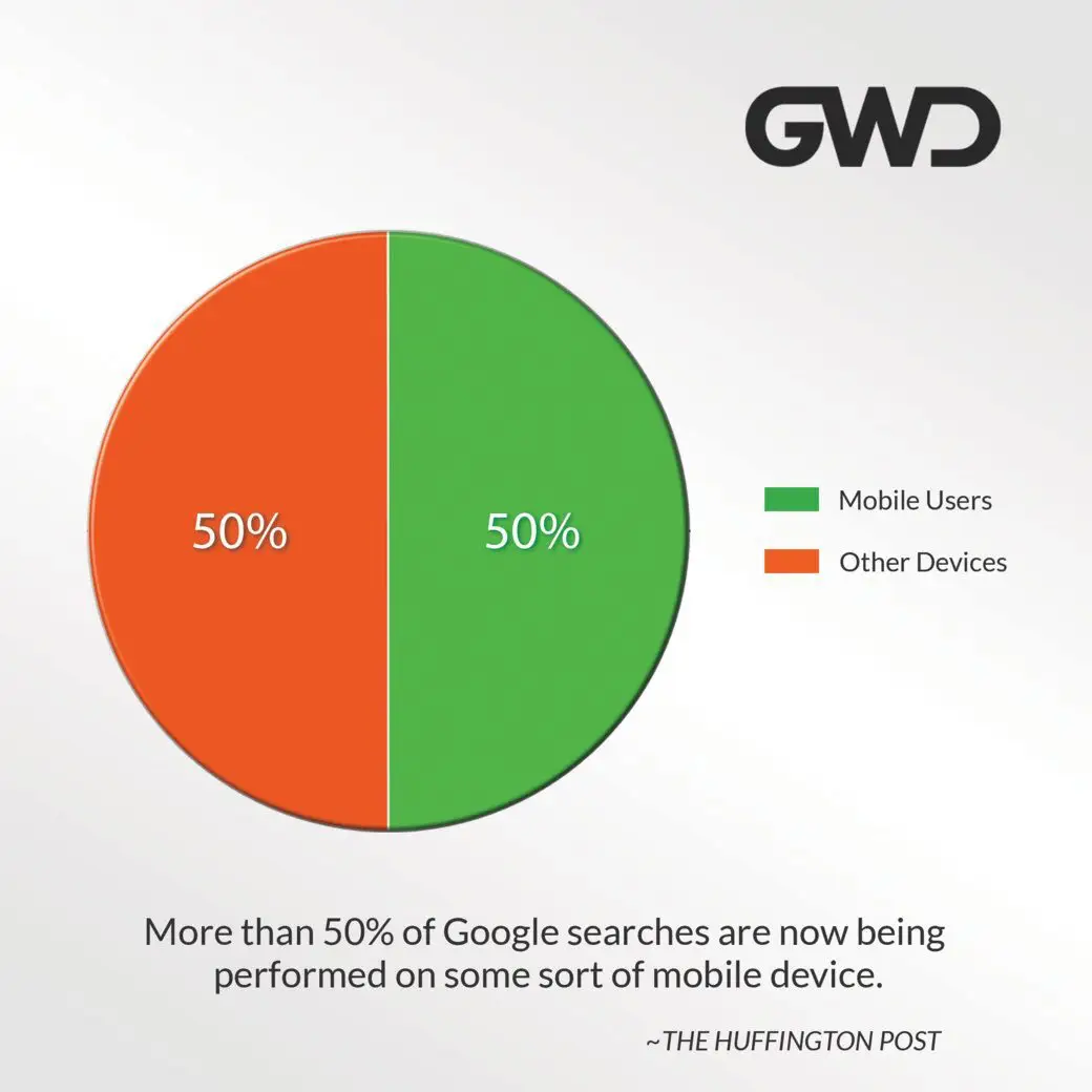 Our super boring chart here tells the simple story, it's now around 50/50, so stop looking at this boring chart and do something about it.
Check your site to see if it is mobile friendly: Google Mobile-Friendly Test
If you are good, site back and relax because you are ready for 2017!
If not, just contact us, we do this everyday and will get you going in the right direction: Contact GWD
DO NOT: Hyper Zoomed-Out Site
 We all have seen the hyper zoomed-out mobile solution. This forces the smartphone to download the whole webpage instead of a quicker responsive version. This is so important that Google publicly supports “Responsive Design” due to speed increases, URL structure, and non-duplicate content.
Also, with the desktop view, users have to zoom in and out to get the information they need. This requires two fingers to zoom and a second hand to hold the phone or tablet. You are crazy to make users put forth that much effort!
On the internet people are extremely lazy and impatient. If they do not find what they are looking for on your website right away, they will move on. If your website is slow to load, they will move on.


Does the New York Times really have a website that is not mobile friendly? That is crazy!!!
haha, that is a great observation. I didn’t even realize how out of date that image is. That NYT image was from a couple years ago when I started preaching about mobile/responsive design!
Yes, I have been focused on mobile since before the NYT even had a mobile website! I just checked though and now they do have one.
Here is a link to a PDF I created a few years back with some of this information. All the concepts are still solid, the examples are just of companies that may have come to their senses!
Check it out: https://groverwebdesign.com/GWDResponsiveDesign.pdf
Do you use a “mobile first” methodology when designing websites?
Ashley, great question. Although, we have a process similar to mobile first, I wouldn’t use that term for what we do.
We focus on designing simple websites (less is more attitude). We keep mobile in mind at all times when designing, but don’t completely polarize ourselves on mobile. We like to stay focused on both desktop and mobile.
My website gets 84% traffic from mobile, it’s insane how important this stuff is now!