Get Your Visitor’s Email Address (Call to Action)

I'm going to keep this simple... if you are not collecting your visitors email address or getting in contact with them in some way, you are missing out on $$$.
Email collection is just one example, the higher level topic here is creating a clear "Call to Action". A call to action is exactly as it sounds, you are calling on your visitors to take an action. If your user takes an action on your website, the chances of turning them into a customer drastically improve!
There are so many great tools out there these days, check out some examples we've set up to try and force visitors to take action!
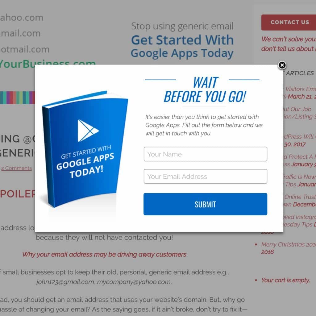
- GWD: https://groverwebdesign.com/news/stop-using-generic-email/ - On this page we use an exit-intent pop-up. This great tool recognizes that the user is moving their mouse towards the X to leave your website and it will show a pop-up contact form... it is a great tool!
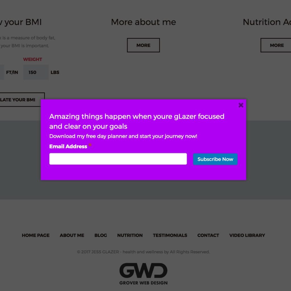
- Jess Glazer: https://jessglazer.com/ - For this website, we used an "on-scroll" method. When the user scrolls down a bit to get more info, we throw them a contact pop-up.
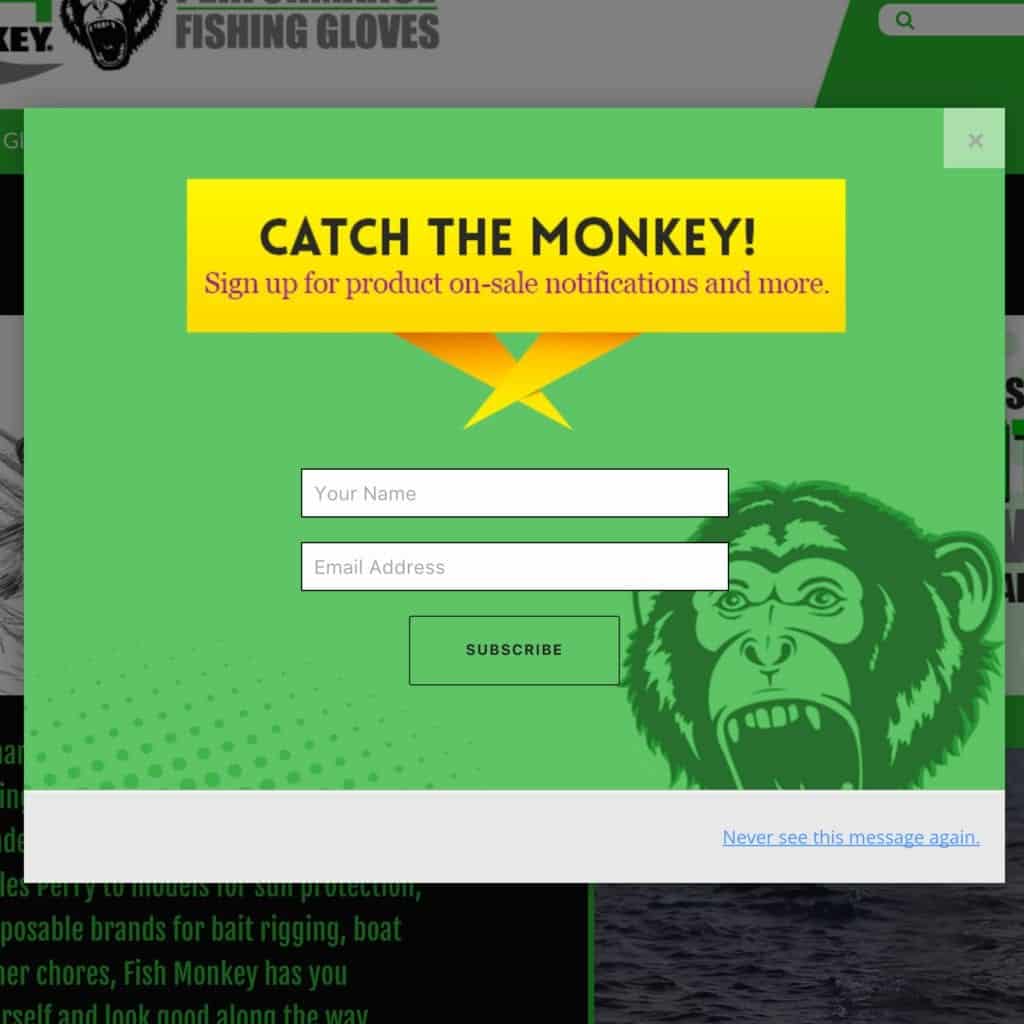
- Fish Monkey Gloves: https://fishmonkeygloves.com/ - Pay attention, this one only happens once! On Fish Monkey Gloves, we implement an "on first view" pop-up that gives people who are visiting the site for the first time a pop-up telling the visitor to sign up for a company newsletter.
We have many more examples, but you shouldn't be spending all your time reading our blog anyway... get back to work. Let us know if you need help implementing a "call to action" method like we have described above.
Now, take action! Contact us to increase the effectiveness of your website!


I noticed this other website that your company made: https://xplorboatworks.com/
I like this “call to action” better because it’s not in your face and does not annoy the visitors. But, is it not as effective?
Hey Tim, thanks for commenting. Yes, the constant battle is annoyance level vs. effectiveness.
In a perfect world, visitors on your website are seeking you out. They go to that contact page and come after you. Those are the people that are basically already sold on your product or service. So, that person is not going to be put out from a pop-up.
The people sitting on the fence however, will feel more obliged to contact you if it’s put right up in there face. This is why I like the “exit intent” pop up the most. It doesn’t annoy them when they are reading your content, but gives that one last “HEY!” before they leave.
If you check out the link above to our GWD page that uses “exit intent”, I think you will like it.
haha… I like the giant emoji pointing at the contact us button!
I have another cool tip on this, most people use contact form 7 to collect information. You should check out Flamingo, it’s an add-on to Contact Form 7 that keeps all the email data right on your WordPress site.
This is good when I want to email all my contacts, I just export them with Flamingo.
Yeah, Flamingo is awesome. We use it on a lot of our clients sites. Here is a link if anyone wants more info: https://wordpress.org/plugins/flamingo/
Btw, just wanted to put in my 2 cents… since focusing on call to actions on my website, our conversions have shot up.
We had good traffic already, but little to no revenue from our site. Now, with a good conversion rate, we are making money!
Can you contact us? We need help with our CTA.
I feel that our site looks great but, does not generate enough leads. I would love to hear your suggestions on what we should do to get more people to contact us through our website.
Here is our site: https://www.toorenburg.net/timzelfbouw
Tim, just reviewed your site. We can definitely help. Thanks for reaching out.
We will be contacting you shortly.