Google Makes “Mobile-friendly” a Priority

Don't feel like reading this long, nerdy article? No worries, just email [email protected]
How to be ready by April 21, 2015
Will you get blindsided by Google?
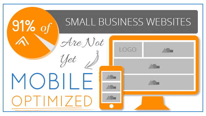
If your website is not mobile-friendly, you could soon be getting significantly fewer hits, losing valuable traffic. Google has announced that beginning April 21, 2015 it will begin to rank mobile-friendly websites higher than those that are designed for desktops only. In other words, your website will have resize appropriately for all smartphones and mobile devices in order to receive a better ranking. Are you prepared?

“Starting April 21, we will be expanding our use of mobile-friendliness as a ranking signal. This change will affect mobile searches in all languages worldwide and will have a significant impact in our search results. Consequently, users will find it easier to get relevant, high quality search results that are optimized for their devices.”
Google Webmaster Central Blog, February 26, 2015

How serious is it?
Some have called it “Mobilegeddon” or even “Mobile-Pocalypse,” referencing a coming shift of biblical proportions. While Google is keeping the details under wraps, it is clear that this revised algorithm is unprecedented departure from the incremental updates of the past.
Jason Demers, Founder and CEO of Seattle-based AudienceBloom writes in Entrepeneur,

- “Zineb Ait Bahajji, a member of Google’s Webmaster Trends team, was quoted at SMX Munich as saying that the new mobile-friendly algorithm change will have more of an impact on search rankings than either Panda or Penguin, two of the largest and most impactful search algorithm updates Google has ever launched.”
Time is running out!
The 2014 blockbuster movie, Noah, starring Russell Crowe brought the epic story of the ancient Flood to the silver screen. In this action hero version, Noah warns people of the coming flood while building the ark that could save them. For decades he implores the people to get on board.

While Google’s new algorithm may not be as disastrous for your business as the Flood, you certainly need to be prepared!
Indicators your website is not ready:
If your website is not built with mobile-friendly responsive design, Google says the following might be just some of the indicators:
- Your web pages load slowly on smartphones.
- When you resize your desktop website, it cuts out much of the content.
- Your website redirects mobile users to a miniature version of your desktop site.
- Videos on your site do not play for the mobile user.
- Links on your mobile website take you to irrelevant pages on your desktop site.

These problems frustrate busy people searching for information about your service or products on their mobile devices. You could lose them to competitors who have mobile-friendly websites.
Some helpful tips on how to get ready:
If your website is not built with mobile-friendly responsive design, Google says the following might be just some of the indicators:
- Read Google’s full announcement for yourself.
- Try out Google’s easy “mobile-friendliness” tool to check if your website is in compliance.
- Be sure your entire website is responsive, not just the homepage.
- Boost your page-load speed with another Google tool to get a better score!
There’s good news!
The good news is that you don’t need to become a technical guru to fix your website. Focus on your own strengths and your business. Let the knowledgeable developers at Grover Web Design use our expertise to convert your website to a mobile-friendly responsive design.
Our website conversions are targeted toward websites like yours that already have a good desktop presence. We do things right, no cookie cutter templates. Your custom responsive website will be based on your current site, providing solid brand recognition for customers visiting you from different devices.
It takes less time and costs less than you think! Contact us today to see how we can help you.
Let’s talk! We will never pressure you. That said, is your website ready for Google’s coming flood?


