
Landing Page Conversion Checklist for Service Businesses
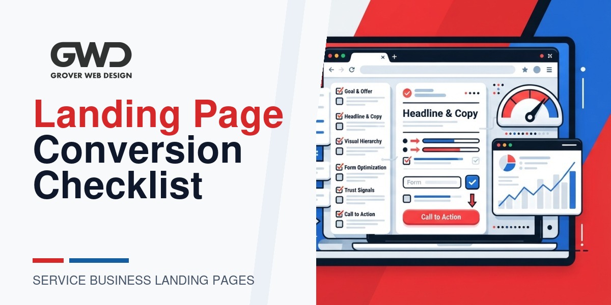
Service businesses need landing pages that turn visitors into leads without overcomplicating the experience. This checklist collects the specific elements we use at Grover Web Design when building or optimizing landing pages for clients: clear offers, fast load times, friction-minimized forms, trust signals, and analytics that make testing simple. Use it as a pre-launch QA and as an iterative CRO playbook once your page is live.
Who this checklist is for
- Local and professional service businesses (consultants, contractors, clinics, agencies) who want predictable lead flow.
- Teams launching a new service page, campaign landing page, or lead-gen form.
- Business owners experimenting with hybrid features — like lightweight AI assistants or custom portals — who want to avoid unnecessary complexity.
How to use this checklist
Run the list twice: once before launch (pre-flight) and again after 30–90 days of traffic. For each item mark Pass / Fix / Improve. Prioritize fixes that remove friction or increase trust — these usually have the largest near-term impact.
Quick conversion goals and UX principles
- One primary action: make the desired conversion the clearest thing on the page (call, form, booking).
- Above-the-fold clarity: headline, single-sentence value prop, and the CTA must be visible without scrolling on mobile.
- Reduce choices: fewer buttons and fewer fields increase completion rates.
- Speed and trust beat bells and whistles: a fast, predictable page converts better than a flashy slow one.
Landing Page Conversion Checklist (structured)
1) Offer & Messaging
- Clear headline: State the core benefit in one line (not a company description). Example: “Emergency HVAC Repairs — Same-Day Service in Columbia.”
- Supporting subhead: One sentence that explains who it’s for and why it’s different (availability, guarantee, price, timeframe).
- Single primary CTA: Label the CTA with the action and the benefit: e.g., “Get a Free Quote — 24 hr Response”.
- Relevance for traffic: Ensure landing page messaging matches the ad, email, or social post that brought the visitor.
2) Above-the-fold essentials
- Visible phone number and a clickable CTA button on the top-right for desktop; sticky CTA or compact header on mobile.
- Short hero paragraph (1–2 lines) and a primary image that supports the offer (trade-specific photo, screenshot of the service, or a short explainer graphic).
- Remove unnecessary navigation when using a paid campaign landing page — keep only minimal links that don’t distract.
3) Form and conversion flow
- Fields: Ask only for what you need. Typical service lead forms: name, phone, email, short description, ZIP/postal code. Every extra field reduces completion.
- Progressive capture: If you need more info, get the phone/email first and ask qualifying questions later (in a follow-up form or call).
- Form UX: Label placement (top-aligned or floating), inline validation for errors, and clear success/error states.
- Button copy: Use benefit-led copy, and indicate next step: e.g., “Request Quote — We’ll Call in 24 Hours”.
- Auto-fill and accessibility: Enable browser auto-fill and make inputs keyboard-friendly for mobile users.
4) Trust signals & social proof
- Include 3–5 succinct trust elements near the CTA: star ratings, short testimonials (1–2 lines), client logos, or security badges.
- For regulated or sensitive niches (medical, legal, HIPAA), display compliance statements and a short privacy note near the form. If you collect PHI, confirm your platform and mailing tools are compliant.
- Use real photos when possible (team or office) — faces build trust faster than stock icons.
5) Copy sequence and microcopy
- Use short bullets for benefits and one short paragraph for the how-it-works (3 steps max).
- Microcopy for hesitations: returns policy, guarantee, price ranges, or timing expectations reduce friction.
- Address top objections near the CTA: “No obligation”, “Free estimate”, “No hidden fees”.
6) Visuals, layout & mobile UX
- Responsive design checks: headline and CTA visible on a 360×780 viewport without horizontal scroll.
- Contrast and CTA size: CTA buttons must be large enough for touch and use high-contrast colors against background.
- Images optimized (compressed, responsive srcset) so they don’t delay page rendering.
7) Page speed & performance
- Target load goals: First Contentful Paint (FCP) under 1.5s and Largest Contentful Paint (LCP) under 2.5s for best mobile experience. Prioritize real-user metrics for your audience.
- Defer or remove third-party scripts that run on initial load (chat widgets, heavy analytics) unless they are essential for conversion.
- Use a well-configured CDN, image optimization, and server-side caching; on WordPress favor lightweight page templates and minimal front-end frameworks.
8) Tracking, analytics & attribution
- Implement goal tracking for the primary CTA in your analytics tool and set up a thank-you page or event-based confirmation.
- Enable UTM parameters for campaigns so you can compare channels and creatives. Record landing page variant in UTM when you A/B test.
- Connect form submissions to your CRM or email system in a way that preserves source and medium. If you batch mail letters or run custom portal automations, plan for data export and privacy checks.
9) Security & compliance
- Use HTTPS everywhere. Ensure contact forms submit over TLS and that inbound data is stored securely.
- For sensitive industries, confirm hosting, backups, and any integrations meet compliance requirements (HIPAA, local regulations). If you need a compliant portal or printing workflow, factor this into scoping and cost.
- Monitor for malware and unauthorized access — WordPress sites are seeing higher attacks; run regular scans and updates.
10) A/B testing & iteration plan
- Start with high-impact tests: CTA copy, form length, hero image, and headline. Run one change at a time to learn what moves the needle.
- Define success metrics before testing (leads per session, cost per lead, form completion rate) and run tests until statistically clear for your traffic level.
- Document results and roll winning variants into the page template so improvements persist across campaigns.
Simple pre-launch QA (do these today)
- Verify the headline and CTA match your ad/email creative.
- Confirm the primary CTA is visible on mobile without scrolling.
- Submit the form yourself and validate the confirmation, autoresponder, and CRM entry.
- Run a mobile page-speed test (WebPageTest or Lighthouse) and fix any LCP blockers.
- Check that the privacy notice and contact details are visible and correct.
Post-launch 30/60/90-day checklist
- 30 days: Confirm form submissions & call tracking are logging correctly. Review session recordings for mobile pain points.
- 60 days: Run your first A/B test on headline or form length. Export leads and review quality from each channel.
- 90 days: Implement structural changes from test winners and update ad messaging to reflect what converts best.
Examples & practical microcopy templates
Use these short templates to speed copy decisions:
- Headline: “[Primary Service] When You Need It Most — [Benefit or Guarantee]”
- Subhead: “Local [service type] serving [area] — fast response and clear pricing.”
- Form CTA: “Request Free Estimate — 1–2 Day Response”
- Phone CTA: “Call Now — Open 8am–6pm”
- Privacy microcopy: “We only use this info to contact you about your request. Read our privacy policy.”
When to add advanced or AI features (and when to avoid them)
Hybrid pages that include lightweight AI (assistants, recommendation prompts, or queryable data) can increase engagement, but they also add complexity. Our practical rule: add automation only when it removes a step for the user (e.g., pre-filling form fields from a short qualifier) and when you can measure its impact.
Avoid heavy interactivity if it:
- introduces significant latency or third-party scripts on the initial load,
- requires users to learn an unusual flow, or
- collects sensitive data without clear compliance plans.
We encourage experimentation — try AI features in a staging environment or an A/B test. Keep the default experience fast and simple.
Technical checklist (developer handoff)
| Item | Developer task |
|---|---|
| Page template | Strip non-essential scripts, ensure server-level caching, and use a lightweight template for mobile LCP. |
| Images | Serve responsive srcset, WebP when supported, and compress to under recommended sizes. |
| Forms | Use AJAX submission where appropriate, prevent duplicate submits, and log server-side events for analytics. |
| Third-party scripts | Load non-essential scripts after user interaction or defer with consent. |
| Security | Enable HTTPS, run malware scans, schedule plugin/theme updates, and lock down admin access. |
Integrations & operations notes
- Connect leads to your CRM with source and UTM fields included. If you want automated print-and-mail workflows, treat the export step as a separate deliverable with security controls.
- For appointment-based services, connect booking software to the landing page and test the full funnel (booking → confirmation email → calendar invite).
- If you need a lightweight portal or project workflow, consider a custom-built solution rather than trying to bolt complex off-the-shelf tools together; modern custom dev is faster and more cost-effective than many expect.
Internal links & next steps
If you want help implementing the checklist on an existing or new page, our services include design, development, and conversion-focused SEO. Learn more about our offerings:
- Grover Web Design – Services
- Custom Web Development for portals, automation, or specialized lead flows.
- SEO Services to make sure your landing pages get relevant visitors that convert.
FAQs
How many form fields is ideal?
Start with the minimum needed to qualify a lead (name, phone, email, ZIP, short description). If you require more details for pricing, collect them later after the initial contact. Use progressive profiling to avoid scaring users away.
Should I remove header navigation from a paid ad landing page?
Yes—reduce choices. For campaign-specific landing pages it’s common to show a minimal header or none at all so the CTA remains the focus. Keep your brand logo visible for recognition.
What are quick wins for slow landing pages?
Compress images, defer nonessential scripts, swap heavy sliders for a single hero image, and use a CDN. On WordPress, prefer a light theme and server-level caching plugins or hosting that handles caching for you.
Can AI tools help conversion immediately?
AI can help with personalization, copy variants, and dynamic FAQs, but keep experiments lightweight. Test AI-driven elements against the simple version and measure impact. Avoid adding latency or complicated flows that reduce clarity.
How do I measure quality of leads?
Track downstream outcomes: percentage of leads that convert to booked appointments, quotes won, or revenue. Use CRM tagging to associate leads with landing pages and campaigns so you can compare cost-per-quality-lead, not just volume.

Talk with Donny about landing page conversion checklist.
Grover Web Design can review the opportunity, improve the page, and connect search visibility to a stronger lead path.